
New Website
-
-
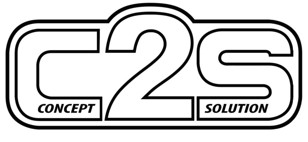
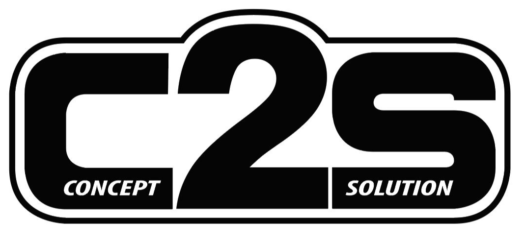
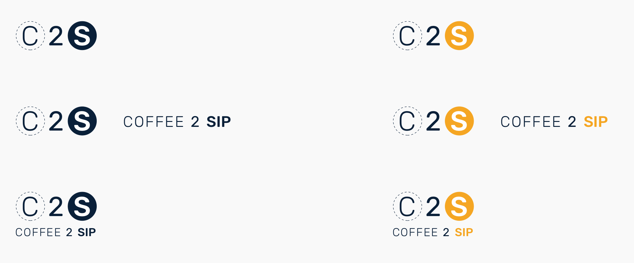
White space added, I like it. I understand what you are saying with the gradient and lines. It was supposed to give it a 3Dimensional look, and I'm old so I thought that was cool. I just had the logo revised in black and what and greyscale these were so I could create handouts with an embossing on them:
And he made one in pink because he's a funny guy. But now we can support breast cancer research, lol.
Can you isolate the text from your pictures more on the landing page?
Text kind of gets lost in between the images.
Isolate how. With more whitespace or borders. I definitely see what you are talking about, where the text gets lost.
-
Long week and needed a mindless break. Just for fun.
-
If you wanted to run with it and needed additional logo, branding collateral work, I could potentially be interested in working out some sort of trade for some waterjet, CNC, etc time... Just to throw that out there. You are rather conveniently just down the road from me.
-
If you wanted to run with it and needed additional logo, branding collateral work, I could potentially be interested in working out some sort of trade for some waterjet, CNC, etc time... Just to throw that out there. You are rather conveniently just down the road from me.
Thanks, I will definitely keep that in mind.
-
Long week and needed a mindless break. Just for fun.
These are good. Feels like it would be at home in front of an artisanal coffee shop in Madison as well.
Skeuomorphism has a weird place in the world of manufacturing based business logos.
-
These are good. Feels like it would be at home in front of an artisanal coffee shop in Madison as well.
Skeuomorphism has a weird place in the world of manufacturing based business logos.
-
Patiently awaiting “C4S”
“coffee 4 shits”
-
-
Long week and needed a mindless break. Just for fun.
This is much better than the old logo, although I think its still not 100%. I liked the added scale of the 2 before, not sure it that will help with this new revision or not without messing with it. Another thing I noticed on the site is you were switching between serif and sans serif fonts. I also agree with the white space rule.
https://www.instagram.com/_jdesigner_/ http://nevertoolow.tumblr.com/
🥳SOLD BMW E24 633CSI - BMW M30B32 🧪SOLD HCH ES9 - 1.3 LDA
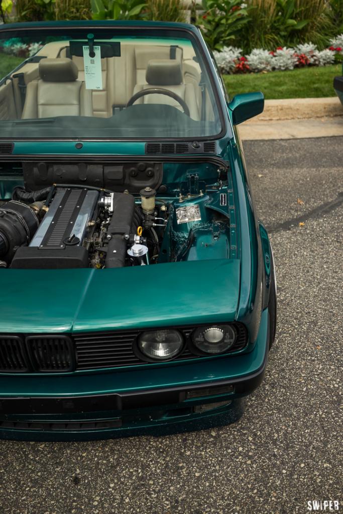
👽BMW E30 325IC - Toyota 1JZ-GTE ⏰ HONDA EF9 CIVIC SI - JDM B18C5
☠️BMW E36 318i - Ford 5.0 FE302 🚴♂️ GT-Labomba - 26x2.75 Freeride
🤹♀️SOLD BMW E36/7 Z3 - BMW M54B25 🧓SOLD BMW E10 2002 - BMW M10M05



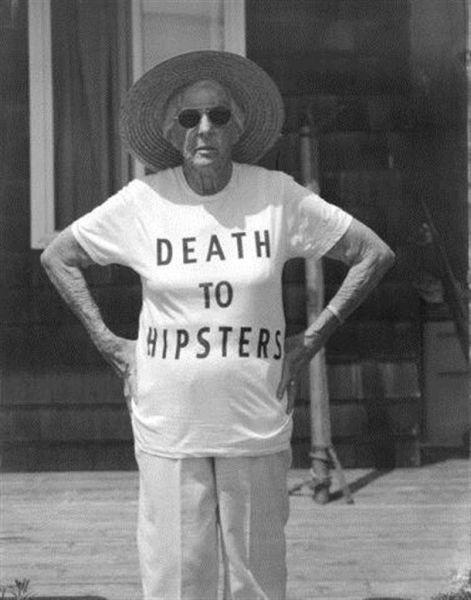
 ️ This is why I keep coming back to this site.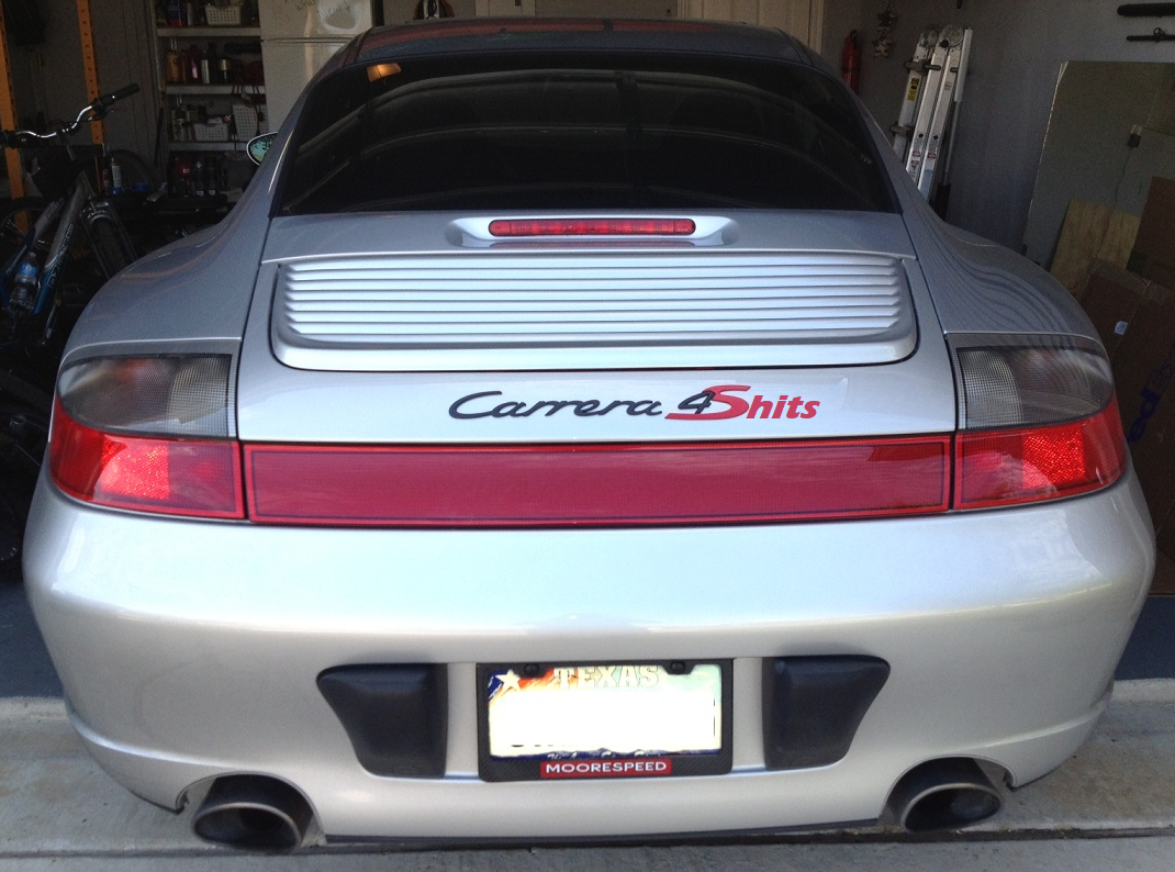
Hello! It looks like you're interested in this conversation, but you don't have an account yet.
Getting fed up of having to scroll through the same posts each visit? When you register for an account, you'll always come back to exactly where you were before, and choose to be notified of new replies (either via email, or push notification). You'll also be able to save bookmarks and upvote posts to show your appreciation to other community members.
With your input, this post could be even better 💗
Register Login