
New Website
-
Nice job! Looks better than 80% of the businesses I work with.
-
Thanks guys.
What do you recommend slowing the swipe down to? I was afraid if someone is hopping around the site they wouldn't see that it was a slide show. I think it's 1.5 or 2 seconds right now. Easy to slow, just need a recommendation.
At some point I want to split up the 'what we do' into different categories, like 3D printing, Fabrication, Mechanical design, etc. Trying to come up with a clean way to do that. Definitely a work in progress, and I really appreciate the feedback.
-
graphic design suggestions:
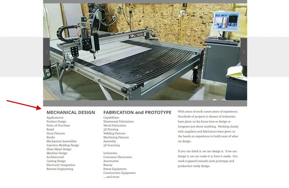
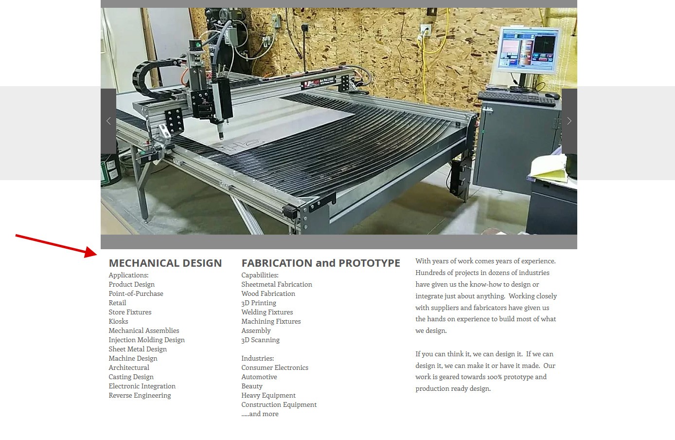
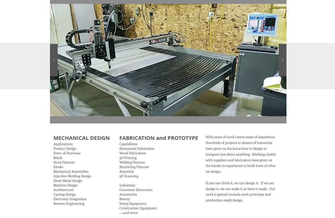
1. more white space between the scrolling image frame at the top and the title text below.
2. make sure the design works for mobile screens too. its a tough balance, but I doubt you want to make a whole separate format for mobile devices.
3. think about a new version of your logo. i don't know how far into the rabbit hole you are with your branding, or far you intend to go, but if you havent invested a ton of money into signs, business cards, tshirts, etc etc, I think it could be better.
general internet presence suggestions:
1. get a couple videos on your website. I'm not saying you need to hire a social media person and launch a campaign, but, bitches love videos.
Dan

-
Looks really good but I am no web developer. If I was shopping around for designing help this website is professional and makes me want to reach out.
@straight6pwr is right though, bitches do love videos
-
@straight6pwr is right though, bitches do love videos
1. get a couple videos on your website. I'm not saying you need to hire a social media person and launch a campaign, but, bitches love videos.
I think I know a guy...
"WHAT'S UP YOU GUYS?! This is Jake Spence.com here at C2S!"
Just sayin'
-
I think I know a guy...
"WHAT'S UP YOU GUYS?! This is Jake Spence.com here at C2S!"
Just sayin'
Ha! So true, but he wouldn't even follow me on instagram, in the short time before I had to leave it. He's too famous for any of us peasants now. lol.
-
graphic design suggestions:
1. more white space between the scrolling image frame at the top and the title text below.
2. make sure the design works for mobile screens too. its a tough balance, but I doubt you want to make a whole separate format for mobile devices.
3. think about a new version of your logo. i don't know how far into the rabbit hole you are with your branding, or far you intend to go, but if you havent invested a ton of money into signs, business cards, tshirts, etc etc, I think it could be better.
general internet presence suggestions:
1. get a couple videos on your website. I'm not saying you need to hire a social media person and launch a campaign, but, bitches love videos.
1. - Which page...all of them? Sorry, don't understand, but I do like whitespace! Unless that makes me racist.
2. - Part of the developer lets you toggle between computer and mobile. It looks ok and works, but that is about it.
3. - We've spent quite a bit on this logo, it's probably gen 4 or 5 over the years. I'm not opposed to re-branding, just not too excited about it. How do you think it could be improved?
2nd. 1. - In process sort of. Not sure videos are in order as I am a really ugly dude, but I speak well, so podcasts are on cue, and maybe some voice-over vids.
Again, I really appreciate all the feedback. We are making an effort to reach out to new companies for new design work. Being business to business can be tough to get the right eyes on your stuff, so when those eyes do get there, I'd like them to be informed and possibly even impressed.
-
1. - Which page...all of them? Sorry, don't understand, but I do like whitespace! Unless that makes me racist.
2. - Part of the developer lets you toggle between computer and mobile. It looks ok and works, but that is about it.
3. - We've spent quite a bit on this logo, it's probably gen 4 or 5 over the years. I'm not opposed to re-branding, just not too excited about it. How do you think it could be improved?
2nd. 1. - In process sort of. Not sure videos are in order as I am a really ugly dude, but I speak well, so podcasts are on cue, and maybe some voice-over vids.
Again, I really appreciate all the feedback. We are making an effort to reach out to new companies for new design work. Being business to business can be tough to get the right eyes on your stuff, so when those eyes do get there, I'd like them to be informed and possibly even impressed.
You don't have to be in the video, or even say anything. For example, check out the background video from this website:https://www.kickrdesign.com/ Its all just b-roll type footage, which is fun and interesting to someone looking for prototyping services.
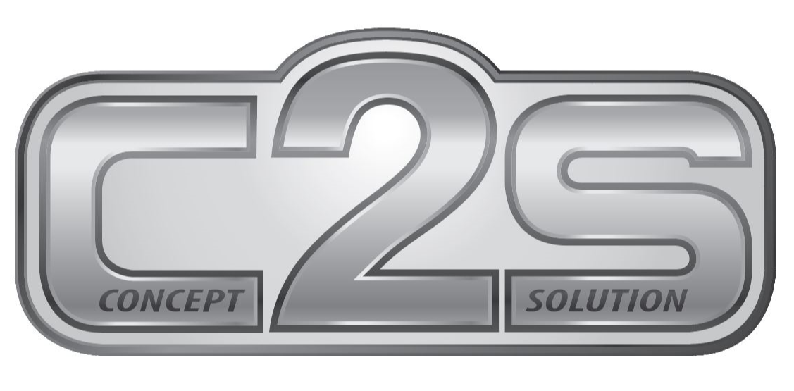
I think the dark-light-dark gradient and different outlines on the logo seem a little outdated to me. Reminds me of Microsoft WordArt. IMHO less detail, and maybe some sort of graphic that nods to mechanical design would be beneficial.
Whitespace location:
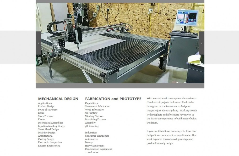
After adding a little bit of whitespace:
Dan
-
-
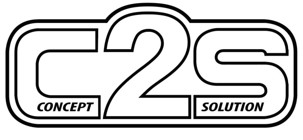
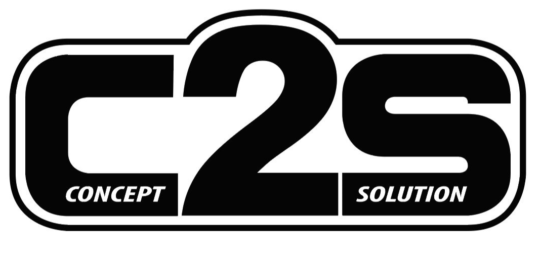
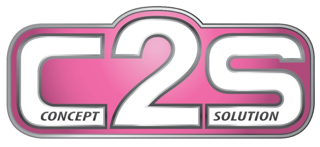
White space added, I like it. I understand what you are saying with the gradient and lines. It was supposed to give it a 3Dimensional look, and I'm old so I thought that was cool. I just had the logo revised in black and what and greyscale these were so I could create handouts with an embossing on them:
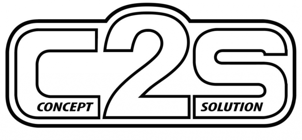
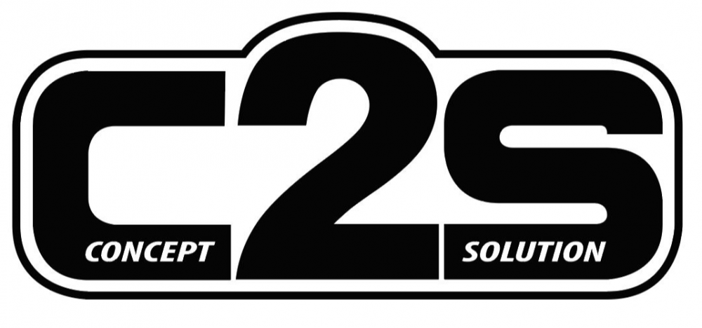
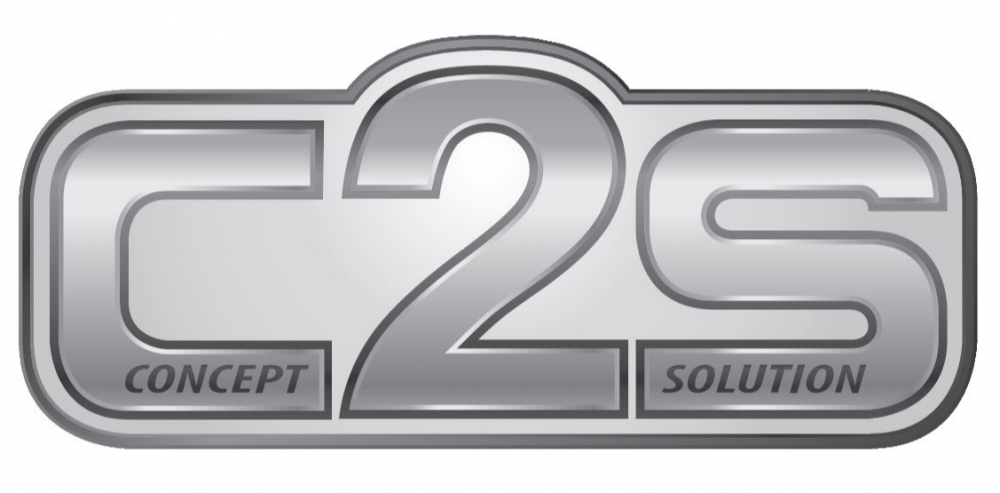
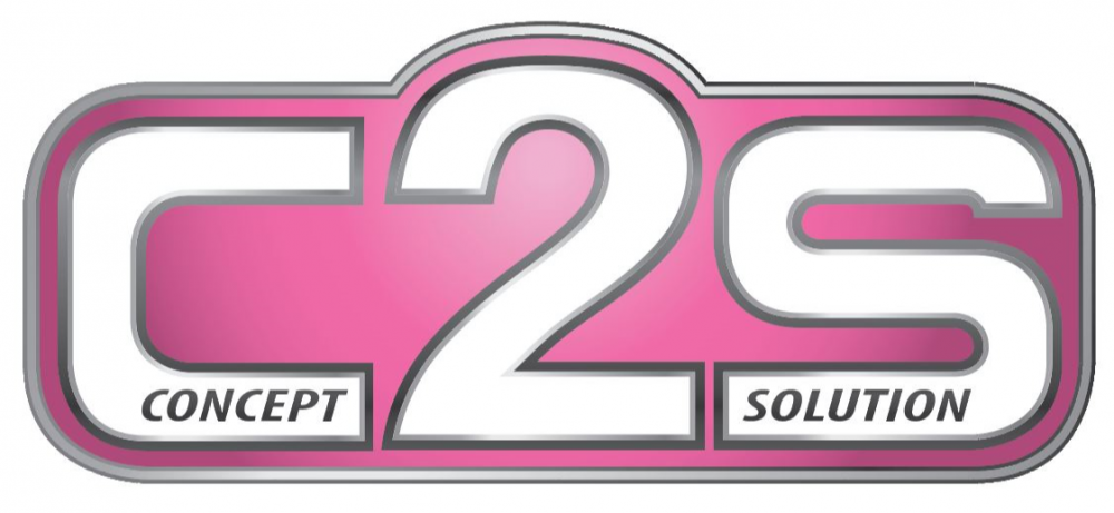
And he made one in pink because he's a funny guy. But now we can support breast cancer research, lol.
Can you isolate the text from your pictures more on the landing page?
Text kind of gets lost in between the images.
Isolate how. With more whitespace or borders. I definitely see what you are talking about, where the text gets lost.
-
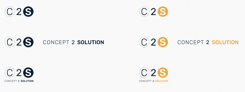
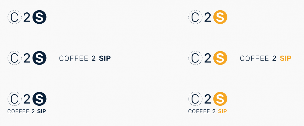
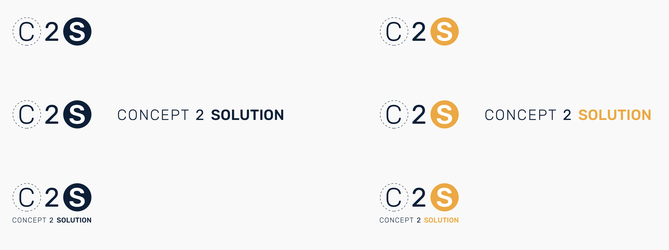
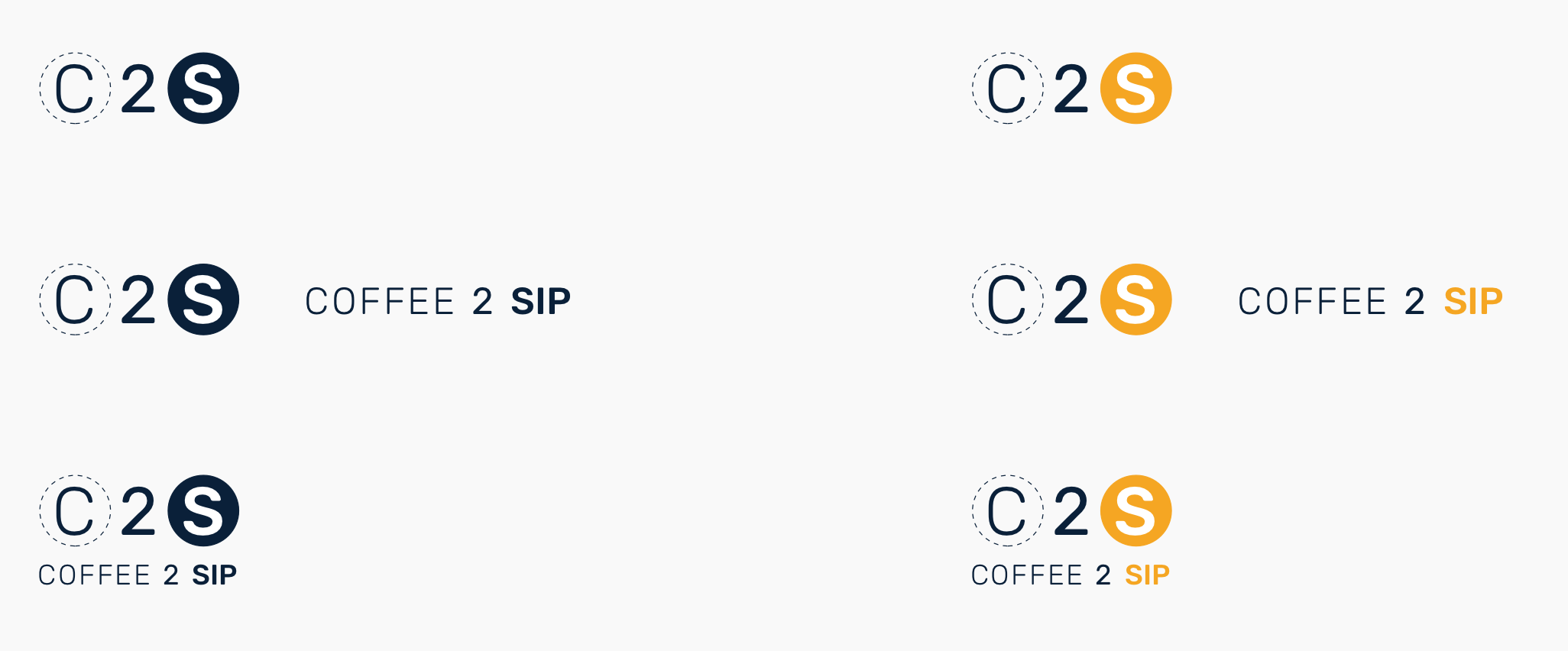
Long week and needed a mindless break. Just for fun.
-
If you wanted to run with it and needed additional logo, branding collateral work, I could potentially be interested in working out some sort of trade for some waterjet, CNC, etc time... Just to throw that out there. You are rather conveniently just down the road from me.
-
If you wanted to run with it and needed additional logo, branding collateral work, I could potentially be interested in working out some sort of trade for some waterjet, CNC, etc time... Just to throw that out there. You are rather conveniently just down the road from me.
Thanks, I will definitely keep that in mind.
-
Long week and needed a mindless break. Just for fun.
These are good. Feels like it would be at home in front of an artisanal coffee shop in Madison as well.
Skeuomorphism has a weird place in the world of manufacturing based business logos.
-
These are good. Feels like it would be at home in front of an artisanal coffee shop in Madison as well.
Skeuomorphism has a weird place in the world of manufacturing based business logos.






Hello! It looks like you're interested in this conversation, but you don't have an account yet.
Getting fed up of having to scroll through the same posts each visit? When you register for an account, you'll always come back to exactly where you were before, and choose to be notified of new replies (either via email, or push notification). You'll also be able to save bookmarks and upvote posts to show your appreciation to other community members.
With your input, this post could be even better 💗
Register Login